Putting out numerous fires with only a little water [Eng, IT, DE]

Museums and Sustainability

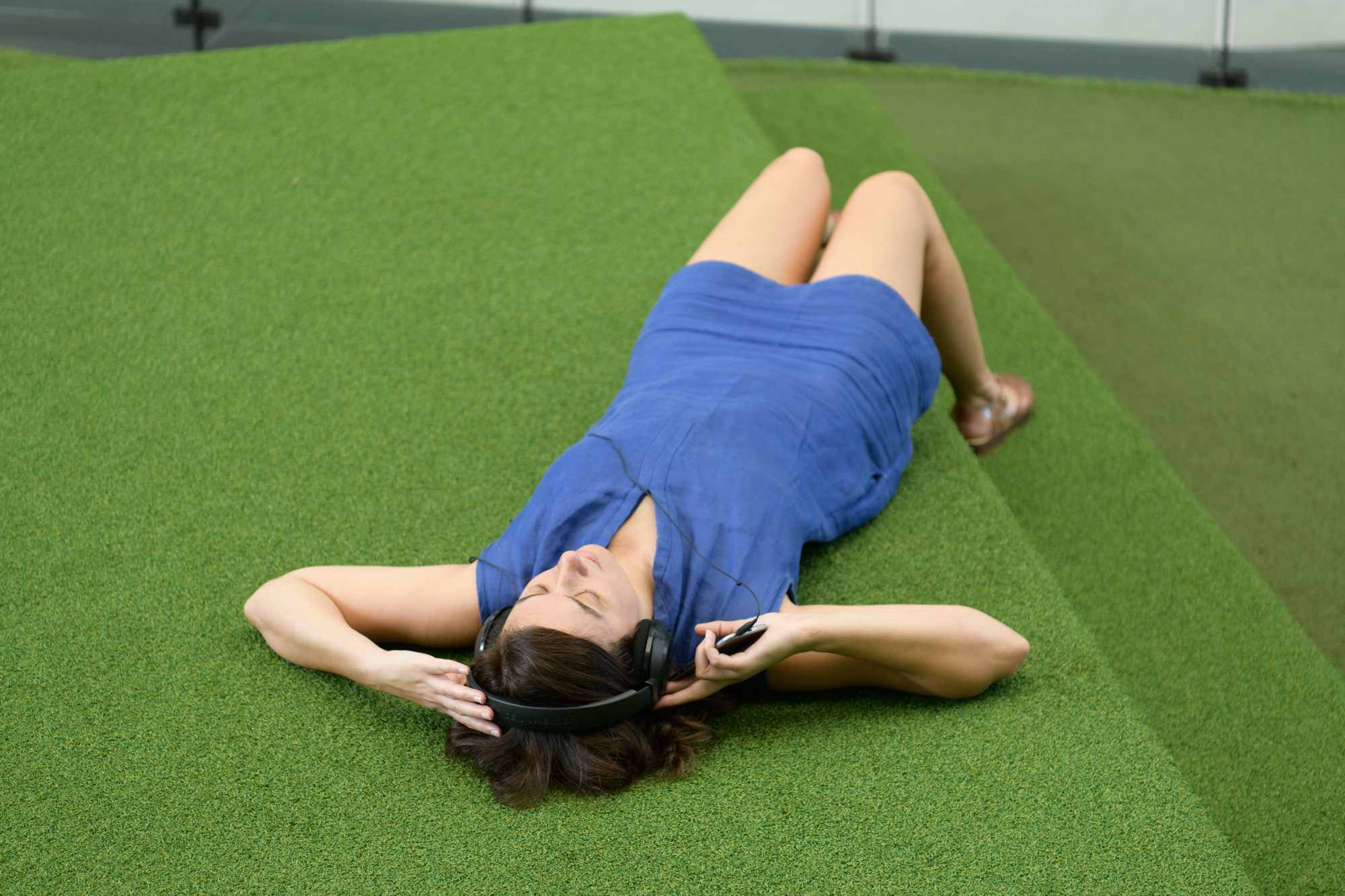
The desire to act and make decisions ethically often clashes with the reality of finding rapid solutions to the micro-emergencies that arise every day. Consequently, the independence and breathing space necessary for envisioning more virtuous processes and genuine best practices are often lacking, as one is constantly preoccupied with chasing immediate results without adequate time or support. It is a bit like putting out numerous fires with only a little water.

Read more on Museion Bulletin March 2024 here

Per la versione Italiana invece qui

Museums at the Ecological Turn (intro IT)

La crisi ecologica non è solo una crisi dell’ambiente fisico ma anche una crisi dell’ambiente culturale e sociale e delle strutture istituzionali con cui la società contemporanea risponde al cambiamento climatico- o non sa farlo- da qui la crisi. 

Da qui partiamo per questa giornata di dialoghi e di prospettive trasversali, avventurandoci in quello che qualcuno ha definito “pensiero rischioso”, cercando di porci delle domande di senso, adottando un linguaggio non giudicante e inclusivo, provando a mettere in pausa il conformismo del discorso pubblico e snodare la dolorosa complessità del presente. 

L’ecosofia ci insegna che ogni cosa è connessa, non ci sono barriere tra discipline, persone e luoghi. La strage di civili in Palestina che non si ferma da oltre 46 giorni, ci riguarda, il femminicidio di Giulia Cecchettin, la 105 donna uccisa in Italia nel 2023, ci riguarda, gli eventi meterologici estremi che colpiscono l’Italia e ovunque, ci riguardano, tutto, lontano e vicino, contribuisce all’ansia e a influenzare la nostra saluta fisica, mentale e a condizionare le relazioni sociali, ambientali e esistenziali. 

Credo che sia importante riferirsi ai fatti, chiamare le cose con il proprio nome, ma soprattutto impegnarsi per mettere in atto dei cambiamenti radicali e significativi, nei livelli e le realtà dove ci troviamo a vivere e operare quotidianamente. Il primo passo è formare una consapevolezza, via via più informata. Per preparare questa giornata di studi, ci sono stati alleate e alleati, molti libri, persone, conferenze sia in Italia che all’estero, che ci hanno preceduto e che seguiranno, in una catena di pensiero generativo e riparatore e di una continua messa in discussione etica dei nostri modi stare al e nel mondo.

Ho curato nel 2022 nel museo che dirigo a Termoli una mostra che si intitolava Le 3 ecologie, come un saggio del 1989 di Felix Guattari, che introduceva la necessità di definizioni plurali e interconnesse tra l’ambiente, l’ambito sociale e quello mentale. I musei sono pluriorganismi complessi, secondo qualcuno “il loro compito è stimolare l’immaginazione, permettere a questioni e problematiche di essere discusse anche se queste non vengano risolte”. 

I musei, e noi oggi, siamo qui a dibattere tra l’estetica e la politica, tra l’attivismo e la responsabilità, che per Donna Haraway è una declinazione di response-ability: la spinta a cercare delle risposte. Parleremo di riorganizzazione, di trasformazione ma anche dell’importanza di riconoscere che NON si tratta di percorsi o scelte individuali ma di un problema collettivo, condiviso, che impatta le comunità ma che supera il dato umano, e abbraccia le multispecie che abitano Gaia. 

L’antropologa Anna Lowenhaupt Tsing declina la parola “sostenibilità” come il sogno di passare una terra vivibile alle generazioni future, umane e non umane. Questo è l’auspicio per la giornata di oggi e che ci possano guidare l’empatia e la cura reciproche. 

Caterina Riva 2023

Grids and Clouds

Benoit Maire Tee-Shirts Rack 2022.

Finding the right tone and structure to tackle Benoît Maire’s oeuvre was tough. My hunch was to adopt a journalistic approach—more New Yorker culture desk than contemporary art analysis—something that could bypass art criticism’s claims to objectivity, but also avoid a personal subjectivity that might risk alienating the reader. Continue reading on e-flux criticism META

Prison becomes Snow White

We are queuing to enter the prison-correction facility, I am not sure what is the appropriate way of calling it these days, the building is surrounded by a high metal fence, there are lamps on each corner, it is in the outskirts of Larino, a town half an hour by car away from Termoli, where I usually live. The guards start letting people in, it becomes clear we need to leave our smartphones at the entrance, we hand it to the closest guard which proceeds to pass it on to the next guard that puts it in a manila envelope, staples it close, and handwrites our names on it.

We are now in an outside area that still isn’t the penitentiary, although there is a guard with a different uniform and has huge golden keys hanging from his belt at the back, it looks theatrical and unnaturally big for a key lock. Someone jokes about Alcatraz, we have all seen those US movies and TV series like Prison Break, but we are very much in Southern Italy with oleander trees and crickets sounds. 

The female director of the prison can be spotted among the visitors because she is the only one clutching a phone and greets warmly the guests. There is someone I know in the audience who asks me: “First time here?” I respond: “Do you mean in prison or at the theatre?”

A play is the reason why around 100 people between kids, families, young and old people, are waiting to go in and watch Snow White. The project is the result of the engagement of people inside and outside the facility and the play is directed by Giandomenico Sale, who has been doing this for a while but, like everyone else, has been stopped for the past two years by the pandemic.

It is time to enter, we move as a swarm, a big creaky red metal door opens to let us in, we cross some kind of passageway and then the gate closes through an automatic system behind us, we are in the courtyard, it looks both alien and quite cozy.

There is someone waiting for us, we are standing in an impromptu circle, he styles a big cartoonish tie and round glasses, he reads from a document: it is the beginning of the Grimm’s fairytale updated to current times and circumstances, going all of 180 degrees from ancient greek theatre played all by men, now all inmates, their surnames erased with pen on the playbill.

After the speaker, another character enters the scene, he’s wearing a shiny jacket, he turns out to be the embodiment of the mirror, which he proceed to reflect a small round mirror towards us as in a liturgy. Addressing the mirror though is the claim of the Queen, who styles a bustier and an amazing orange wig. She speaks in Neapolitan rhyme, in the local tradition of hyper-feminine male characters known as “femminielli”, call it drag queen if you follow Ru Paul’s globally televised race. I caught at the corner of my eye, although the light was setting, the movement of someone wearing a white robe, The figure is gracefully running around, or should I say more escaping the hunter that has been ordered by the evil queen to kill her. Super catchy pop music anthems, like Staying alive make you move and sing along even if you try to resist the rhythm, accompany the action. We go to the seats and look at the stage which develops in front of a short building: some cheerful individuals from cap to shorts all wearing different uniforms of American basketball teams (Celtics, Lakers…), are none other than… the Seven Dwarfs! The brilliant music choices as well as the uniforms I believe have the input of American choreographer Richard Move who came from New York to Molise to work on this hopeful project with Sale.

We know how the rest of the story goes, the poisoned apple, the sleep and … here comes Prince Charming, sporting a Tony Manero white suit, cigarette in his mouth, sunglasses and the entrance of a true dance floor hero. It is pretty entertaining and even the kids seem to have a good time, it finishes sooner than I wanted and people clap and clap some more, laughing and cheering the cast. There is some food been offered to the guests so people can chat and mingle, the actors are among us but they have taken off their costumes with the exception of the dwarfs that seem to be at ease in their jerseys. it is nice to be together, in the moment, with no phones, no distraction, cola and ginger instead of alcohol. The other inmates, not part of the show, whistle at a distance. When we leave, I wonder if the memory of the night will give me and them something to look forward to, like a kiss that will awaken those among us in limbo.

Caterina Riva 2022

Benoît AND Maire, A Philosophical Quest [ENG,FR]

Benoît Maire, Peinture de nuages, 2022. Acrylic spray paint and oil paint on canvas, 122×200 cm. Photo: Daniele Molajoli

When an unexpected invitation to write a text on French artist Benoît Maire landed in my inbox, I realised it had been more than ten years since I last engaged with his work. Back then, I was living in London and running a curatorial project space called FormContent while Maire was often visiting the city for various exhibitions.

As part of the research towards the writing commission, I was invited to spend a few days in Rome at Villa Medici, the French Academy situated at the top of Trinità dei Monti. Benoît Maire is currently one of the 2021-2022 Visual Arts Fellows. He occupies a studio apartment on the grounds of the luscious gardens populated by pine trees, sculptures and real-life, shitting peacocks. Caterina Riva 2022

read on Fondation Pernod Ricard’s Textwork

Featured

WOOL-TOOL [IT,ENG]

OSTINATO – un tributo a Franco Grignani – progetto realizzato durante il workshop di stampa Risograph per la 9° edizione di SPRINT—Independent Publishers and Artists’ Books Salon, Milano, 2021. Grazie a Istituto Svizzero, Spazio Maiocchi, GMUND Paper, Eilean Friis-Lund, Alice Vodoz, ATTO, Elena Radice, Clelia Colantonio, Silvia Carollo, Ilenia Arosio | sprimilano.org

Anni fa sono rientrata in Italia dalla Nuova Zelanda con un cuore infranto e un plaid bianco, nero e fucsia made in New Zealand di pura lana vergine. Quel “marchio della lana” riportato sull’etichetta è l’invenzione di un grafico italiano, Franco Grignani, che nel 1963 vinse un concorso internazionale indetto dall’IWS-International Wool Secretariat. Chiudete gli occhi e ricostruite quella immagine, la vedete? Si tratta di un gomitolo tripartito in bianco e nero senza un chiaro inizio e una fine, quasi fosse un groviglio di filo infinito.

In preparazione alla scrittura di questo testo, ho sfogliato cataloghi delle mostre di Grignani, seguito link italiani e internazionali che ne discutono la carriera artistica e grafica e guardato gallerie di immagini dei suoi lavori nei vari campi in cui ha operato. In questo modo ha preso forma una grammatica, un vocabolario fatto dall’impiego del bianco e nero, da una struttura ortogonale che diventa campo per una sperimentazione di fenomeni ottico-percettivi derivati da trattamenti che prevedono torsione, deformazione, vibrazione, flou e altro.
Il metodo compositivo di Grignani non è mai statico, disdegna la figurazione e una prospettiva centrale, e si muove dentro, fuori, agli angoli.
Il chiaroscuro protagonista delle sue pitture e del lavoro grafico è indebitato alla fotografia mentre la psicologia della Gestalt [della forma] gli offre il concetto di insight [vedere dentro] insieme a un procedere per prove ed errori, si apprende dunque con la percezione e tramite continue esperienze. Le sue creazioni mostrano intuizioni creative che svilupperanno appieno il loro potenziale in ambito digitale.

Mi colpisce una foto di Grignani negli anni ’80, nel suo studio a Milano, indossa un camice bianco–da oculista mi verrebbe da dire–aperto su una camicia e una cravatta, al muro sono appese delle sue creazioni, sulla scrivania invece regna un caos di materiali, diapositive, vetri, scatole, fogli, tutti accatastati come in un laboratorio, un centro sperimentale d’indagine e di prove ripetute. “Cercavo anche di formare una grammatica per bloccare valori costanti e per individuare un metodo operativo-critico” spiega Grignani in “Note per un percorso” nel catalogo della mostra Segno Scrittura Spazio a cura di Lisa Bellotti al Circolo culturale Koh-I-Noor di Milano nel 1986.

Milano è la sua città d’elezione da qui Grignani lavora, tra le altre committenze, per la casa farmaceutica Dompé: mirabili le pubblicità per prodotti come Artrosil, che prevede figure atletiche che saltano l’ostacolo, corrono, volteggiano in aria con efficienza olimpica, o Cardioritmon che prevede un manifesto nero su cui si staglia un filo bianco la cui presa si collega a un grande cuore stilizzato bianco, che ne contiene uno giallo, uno rosso e uno azzurro che si intersecano [altro che emoticons!]. E si occupa, sempre per Dompé, anche della grafica della rivista Bellezza d’Italia, abbreviata in copertina con intuito contemporaneo in Bd’I.
I lavori per Alfieri&Lacroix, “Tipolitozincografica in Milano propone la comunicazione nell’induzione grafica” – come recita un manifesto del 1965 ora nella collezione del MoMA – sono riconoscibili per il tentativo di modellare nuove proposte linguistiche di produzione grafica.
L’annuario Pubblicità d’Italia invece raccoglie quello che succede sul piano della comunicazione pubblicitaria attuando un’analisi consapevole del mondo della pubblicità e del suo evolversi nel nostro paese e Grignani ne è art director dalla fondazione negli anni Cinquanta fino al 1985. 

Sempre a Milano, come ci ricorda una foto che li ritrae insieme in posa su una rotonda stradale, Giulio Confalonieri, Silvio Coppola, Franco Grignani, Bruno Munari e Pino Tovaglia avevano dato vita al gruppo Gruppo ED [Exhibition Design]. Il gruppo auspicava il superamento del concetto di autorialità del singolo, rifletteva inoltre su una metodologia progettuale di ricerca interdisciplinare e sull’importanza della articolazione dello spazio espositivo per instaurare una reale comunicazione con il pubblico. 

Una mostra di Grignani si tenne nel 1967 al Centro Culturale Pirelli di Milano e ne vorrei un momento analizzare l’impianto allestitivo a partire da alcune immagini d’archivio. La mostra alterna sculture elicoidali poggiate a terra con opere bidimensionali che sono poste in teche di vetro rettangolari, frontali allo spettatore, che si innestano su delle gambe metalliche. Il perimetro delle sale è riempito ordinatamente da questi dispositivi ed il movimento delle immagini e delle sculture pare riflettersi anche nel linoleum sul pavimento, che essendo a chiazze maculate, potrebbe essere scambiato per un esperimento ottico di Grignani.

Il nome di Franco Grignani non è annoverato tra quello degli artisti che partecipano alle mostre internazionali che storicizzano i movimenti formatisi nel Dopoguerra, come la Op [Optical] Art indagata nel 1965 dalla mostra The Responsive Eye al MoMA di New York e dal documentario dello stesso titolo di Mike Wallace, facilmente reperibile su youtube, che offre una viva testimonianza immortalando le reazioni a caldo del pubblico newyorchese.
Nello stesso anno però Grignani è tra i relatori, assieme a Buckminster Fuller, Marshall McLuhan, Eugenio Carmi ed altri, della conferenza Vision 65 “New Challenges for Human Communication” alla Southern Illinois University, Carbondale. 

Nel 1968 David Pelham, art director per la narrativa della casa editrice inglese Penguin, commissiona a Franco Grignani la creazione di sedici copertine per altrettanti libri della loro collana tascabile di fantascienza, tra cui si annoverano anche titoli di Ray Bradbury e di Philip K. Dick. Le copertine sono tutte su sfondo nero da cui si liberano immagini e forme monocromatiche, un colore diverso per ciascuna copertina, queste visioni astratte, allusive di movimenti, fin dalla copertina ci accolgono in altre percezioni, non certo pacificate.

La critica d’arte Lara Vinca Masini scrive nel 1966: “Così ai simboli odierni della comunicazione di massa, attraenti, colorati, cattivanti, ipnotici, Grignani oppone i simboli della sua comunicazione, ossessionanti, altamente espressivi, drammatici e violenti che mettono l’osservatore di fronte a se stesso, lo esigono sveglio e responsabile, lo costringono, incessanti, a riprendere dominio di sé, a ritrovare, in una riconquistata completezza, la dimensione esatta dello spazio umano, e alla luce della ragione, della emozione, della fantasia, la propria inesauribile – e demiurgica – potenzialità di creatore di forme.” Lo spettatore ritorna protagonista di una comunicazione che non prescinde mai dalla sua reazione, conscia o inconscia che sia. 

Una serie di foto del 1967 ritrae la figlia dell’artista, Manuela, in riva al mare al tramonto, gli arti si irradiano controsole mentre regge delle composizioni di forma quadrata realizzati dal padre che la fotografa e con i suoi movimenti crea una partitura, un alfabeto di forme, che si propaga a onde, come in uno specchio, verso la nostra percezione.

Caterina Riva, 2022 testo commissionato da SPRINT

OSTINATO – un tributo a Franco Grignani – progetto realizzato durante il workshop di stampa Risograph per la 9° edizione di SPRINT—Independent Publishers and Artists’ Books Salon, Milano, 2021. Grazie a Istituto Svizzero, Spazio Maiocchi, GMUND Paper, Eilean Friis-Lund, Alice Vodoz, ATTO, Elena Radice, Clelia Colantonio, Silvia Carollo, Ilenia Arosio | sprimilano.org

Years ago I returned to Italy from New Zealand with a broken heart and a New Zealand white, black and fuchsia tartan blanket made of pure virgin wool. That “wool trademark” shown on the label was invented by an Italian graphic designer, Franco Grignani, who in 1963 won an international competition organized by the IWS-International Wool Secretariat. Close your eyes and reconstruct that image, do you see it? It’s a yarn composed of three black and white parts without a clear beginning or end, as if it were a tangle of infinite thread.

As I was preparing to write this text, I leafed through Grignani’s exhibition catalogues, I searched for Italian and international links in which his artistic and graphic career was discussed and looked at image galleries of his work across various fields in which he operated. This is how grammar took shape, a vocabulary established through the use of black and white, an orthogonal structure which becomes a platform for experimentation with optical-perceptive phenomena derived from treatments involving torsion, deformation, vibration, flow, and more. 

Grignani’s compositional method is never static, it disdains figuration and a central perspective, and moves in, out, at the corners.

The chiaroscuro main character of his paintings and graphic work is indebted to photography while the psychology of Gestalt [of form] offers him the concept of insight [to see inside] together with a process of trial and error, therefore learning goes hand in hand with perception and through continuous experiences.

I was struck by a photo of Grignani in the 1980s, in his studio in Milan, wearing a white coat – an optometrist’s I would say – open on a shirt and a tie, his creations hung on the wall, while on the desk a chaotic arrangement of materials, slides, glasses, boxes, sheets, all stacked up as in a laboratory, an experimental centre conducting research and frequent tests.

“I was also trying to form a grammar to block constant values and to identify an operational-critical method” explains Grignani in “Note per un percorso” in the catalogue of the exhibition Segno Scrittura Spazio curated by Lisa Bellotti at the cultural centre Koh-I-Noor in Milan in 1986.

Milan is the “chosen” city where Grignani works, among other clients, for the pharmaceutical company Dompé: the advertisements for products such as Artrosil are remarkable, they include athletic figures that jump over obstacles, run, spin in the air with Olympic efficiency, or Cardioritmon composed of a black poster on which a white cord stands out, an electrical plug connects to a large stylized white heart, that contains in itself three other hearts in intersecting yellow, red, and blue [move aside, emoticons!]. 

And he also works, again for Dompé, on the graphics for the magazine Bellezza d’Italia, shortened to Bd’I as a contemporary intuition on the cover.

The works for Alfieri & Lacroix, “Tipolitozincografica in Milano propone la comunicazione nell’induzione grafica” [“Typolitozincographic in Milan proposes the communication in graphic induction”] – as declared in a 1965 manifesto now included in the MoMA’s collection – are recognizable for their attempt to model new linguistic proposals within a graphic production.

The Yearbook Pubblicità d’Italia  instead, collects what happens in advertising by developing a conscious analysis of its world and its evolution in our country, and Grignani is appointed art director from its foundation in the 1950s until 1985.

Also in Milan, as a photo of them posing together on a roundabout reminds us, Giulio Confalonieri, Silvio Coppola, Franco Grignani, Bruno Munari, and Pino Tovaglia created the Gruppo ED [Exhibition Design] group. The group hoped to overcome the concept of individual authorship, they also reflected on an interdisciplinary research design methodology and on the importance of articulating the exhibition space to establish real communication with the public.

An exhibition by Grignani was held in 1967 at the Pirelli Cultural Centre in Milan and I would like to take a moment to analyse the layout starting from some archival images. The exhibition alternates helicoidal sculptures placed on the ground with two-dimensional works placed in rectangular glass cases, facing the viewer, grafted onto metal legs. The perimeter of the rooms is neatly filled with these devices and the movement of the images and sculptures also seems to be reflected in the linoleum on the floor that, with its spotted pattern, could be mistaken for an optical experiment by Grignani.

The name of Franco Grignani is not listed among those of the artists participating in international exhibitions that historicize the movements formed in the post-war period, such as the Op [Optical] Art investigated in 1965 by the exhibition The Responsive Eye at the MoMA in New York and by the documentary of the same title by Mike Wallace, easily available on YouTube, which offers a living testimony immortalizing the heated reactions of the New York public.

In the same year, however, Grignani is among the speakers, together with Buckminster Fuller, Marshall McLuhan, Eugenio Carmi, and others, at the Vision 65 conference “New Challenges for Human Communication” at Southern Illinois University, Carbondale.

In 1968 David Pelham, art director for the fiction section of the English publishing house Penguin, commissioned Franco Grignani to create sixteen covers for as many books in their science fiction pocket series, including titles by Ray Bradbury and Philip K. Dick. The covers are all on a black background upon which monochromatic images and shapes are set, a different colour for each cover, these abstract visions, alluding to movements, beginning from the covers, that welcome us into other perceptions, certainly not peaceful.

In 1966 the art critic Lara Vinca Masini wrote: “To today’s symbols of mass communication, attractive, colourful, captivating, hypnotic, Grignani opposes the symbols of his communication, haunting, highly expressive, dramatic and violent ones, that put the observer in front of himself, they demand him to be awake and responsible, forcing him, incessantly, to regain self-control, to rediscover, in a regained completeness, the exact dimension of human space, and in the light of reason, emotion, fantasy, his own inexhaustible – and demiurgic – potentiality as a creator of forms.” The viewer returns as protagonist of a communication that never ignores his reaction, whether conscious or unconscious.

A series of photos from 1967 portrays the artist’s daughter, Manuela, by the sea at sunset, the limbs radiate against the sun while holding square-shaped compositions made by her father who photographs her and with her movements creates a score, an alphabet of shapes multiplying in waves, as in a mirror, towards our perception. 

Translated from Italian by Clelia Colantonio for SPRINT

Hacker

Invited by MUDAM Luxembourg to be part of Lara Favaretto’s project Thinking Head discussing the word HACKER in a Clandestine Talk together with Patrice Riemens and Stéphane Duguin on November 4th. The audio recording is available here.

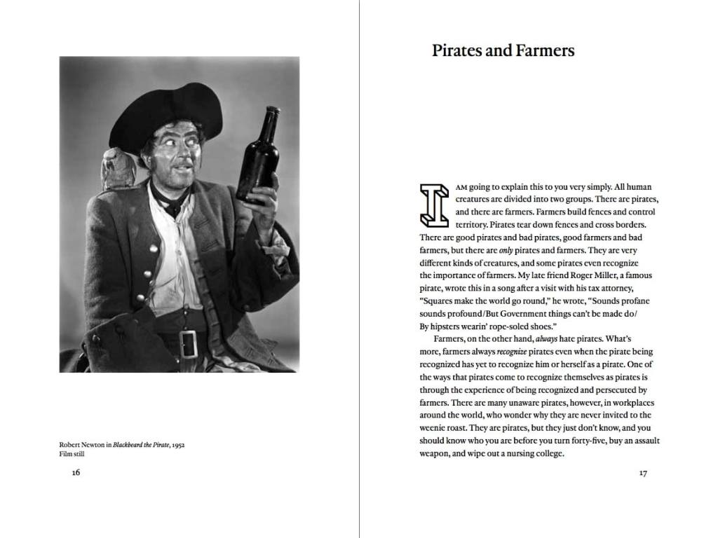
From Dave Hickey (1940-2021)’s Pirates and Farmers, 2013 an essay I quoted during the talk

L’età dell’algoritmo [IT]

Intervista a Massimo Mazzotti e Shreeharsh Kelkar dell’Università di Berkeley

Una varietà di significati è stata attribuita all’onnipresente parola “algoritmo”[1], man mano che essa si allontana dalla sua definizione originale di “procedura per risolvere un problema matematico”. Per capire meglio le sue trasformazioni e il suo uso, ho parlato con colui che ha definito la nostra epoca “l’età dell’algoritmo”

Continua a leggere su antinomie> https://antinomie.it/index.php/2021/04/12/leta-dellalgoritmo/

The Age of the Algorithm

A variety of meanings has been attributed to the ubiquitous word “algorithm”[1], as it gradually moves away away from its original definition of  “a procedure for solving a mathematical problem”. In order to better understand its transformations and use, I spoke to the person who has referred to our epoch as “the age of the algorithm”[2]. Massimo Mazzotti is a historian and sociologist of science at the University of California, Berkeley, where he is also the Director of the Centre for Science, Technology, Medicine & Society (CSTMS), “a laboratory [conducting research]… on the histories and implications of scientific research, biomedicine, and new technologies”[3]. Mazzotti connected me with Shreeharsh Kelkar, who is a lecturer in the Interdisciplinary Studies program and affiliated with the Algorithmic Fairness & Opacity Working Group (AFOG), whose mission is to develop “policy recommendations around issues of fairness, transparency, interpretability, and accountability in algorithms and algorithm-based systems”[4]. In this interview, we identify algorithms as tools and look at some of their implications, including profiling and record-keeping.

Caterina Riva, 2021

Caterina Riva interviews UC Berkeley scholars Massimo Mazzotti and Shreeharsh Kelkar on algorithmic systems, featuring artworks by Elisa Giardina Papa’. Keep reading on so far.

An evening with M92 +Ambra Viviani

Ambra Viviani I that do bring the news made not the match (I), 2018 iron, PVC, aluminium, glass, sodium chloride, sodium carbonate

M92 was assembled in Wuhan, China in 2020, she bears no expiration date. At 9pm each day she enters the condo’s swimming pool, after swimming exactly 60 laps, she lies on a reclining plastic chair, water dripping from her industrially manufactured skin. While a puddle gathers under the chair following the bends of her body, she recites from her memory card words she has downloaded from various sources. Tonight they are from a book written in 1970 on Italian cinema. She starts with Italian words beginning with the letter A: Amore, Accarezzare, Azzardo, Ancora. She attempts translations in other languages like English: Love, Caressing, Hazard, Again. The alphabetical order is no longer valid, the rhythm changes.

Caressing implies touching and touching is forbidden since the bacteriological invasion of 2025, where even insects became extinct and had to be artificially produced. KT is M92’s pet beatle, often its transparent colour makes it hard to spot amid the plastic furniture but the noise reveals its presence when it flies. The metal shelf is a favourite spot for KT, it is also where M92 keeps her most treasured possession, a small book, printed on transparent sheets in 2019 by someone called Minne de Curtis, M92 found it in a spatial dumpster on Vega. She loves passing her fingers through it, each time she finds something new: today she spotted a small pot containing olive oil used in ancient times for sacred rituals. Repeat, tomorrow.

Find complete entry with artwork by Ambra Viviani here

Sriwhana Spong: A Re-Enchantment of the World

Sriwhana Spong Tasseography of a Rat’s Nest (extended), 2018.
Installation view: A hook but no fish, Govett-Brewster Art Gallery, New Plymouth, 2018.
Courtesy of the artist and Michael Lett Gallery. Photo: Samuel Hartnett.

I met the artist Sriwhana Spong in 2011 when I lived in Auckland, New Zealand, which is also her hometown. Today, she lives in London, and that’s where she spent the lockdown period. When we spoke from our respective lockdowns on a video call, Sriwhana was sporting an amazing high ponytail à la Ariana Grande and big headphones, as if she was a musician in her own recording studio. Sriwhana had sent me some links to her films to watch before the call and I formulated the questions below.

We spoke of many things: how to stay open during a pandemic, the feeling of being “far” from home no matter where you are, her peculiar personal history split between New Zealand and Bali, and how that created the conditions for the choreographic making of her filmic, sculptural and performative work. The following transcription alights on Sriwhana’s interests in animal bestiaries, performance as conduit to other dimensions, and the language of the ancient Christian mystics. Couched in the same refrains and legacy, hers is a language that could possibly re-enchant the post-pandemic world.

Continue reading on so-far

Glitch Feminism: Legacy Russell

La solidarietà al movimento Black Lives Matter, dopo l’uccisione di George Floyd da parte degli agenti di polizia di Minneapolis, si gioca per strada con cartelli e mascherine ma anche sugli schermi dei nostri smartphone. Legacy Russell vive a New York City, è attivista per i diritti delle persone QTPOCI+ (Queer & Trans, People of Color, Indigenous), lavora come curatrice allo Studio Museum di Harlem e ha scritto un libro, Glitch Feminism, uscito da poco per Verso. A giugno l’abbiamo contattata per parlare delle proteste esplose nella sua città e nel resto degli Stati Uniti, e per riflettere sul rapporto che collega il cyber femminismo, l’attivismo digitale e le tecnologie di sorveglianza. Caterina Riva per Rivista Studio, 2020

Potresti descrivere come stai vivendo questo momento da persona americana nera?
È un periodo devastante. Niente di quello che è successo è nuovo, in realtà, ma la confluenza di tutto ciò a cui abbiamo assistito sta portando a galla le storie problematiche e profondamente radicate che hanno gettato le basi per l’attuale condizione mondiale. Come parte della mia pratica quotidiana, continuo a lavorare per liberarmi, amare, celebrare l’importante lavoro degli altri e impegnarmi attivamente per fare spazio nella storia dell’arte per le persone QTPOCI+.

Continua a leggere su Rivista Studio

RIVIERA [IT]

RIVIERA Book TV con Costanza Candeloro, Istituto Svizzero, 2016. Foto di Ivan Grianti

Celant scriveva nel 1971, in un epoca d’oro per mostre-idea che esistevano nella mente, in pubblicazioni e nel ricordo di chi aveva preso parte agli happening. Nel 2020 ci confrontiamo con una memoria smaterializzata e annacquata dal digitale e ad un’offerta bulimica. RIVIERA era un progetto ibrido-utopico forse un po’ romantico, condito dal nostro feticismo per l’oggetto-libro e l’innamoramento per la variazione semantica dello stesso. Nel comunicato abbiamo scritto: “RIVIERA è un progetto in cui il libro si fa protagonista: come oggetto, contenuto, forma, pretesto, fissazione, collezione o curiosità, specchio, ostacolo, miraggio.” La proposta nelle nostre intenzioni era varia come la tipologia degli eventi e il pubblico, e funzionavamo sia come agenzia di comunicazione milanese che come agenzia universale per artisti squattrinati. Caterina Riva, 2020

Continuate a leggere le domande di Progetto Replica su ATP DIARY

ad una giovane donna di Daniela Zangrando

Pattuglie di cavalleria in perlustrazione, ottobre 1918
Courtesy Museo Storico Italiano della Guerra, Rovereto.
Dovrai imparare a godere la bellezza di una ghiandaia
e l’incanto inaccessibile dell’azzurro che ti svolazzerà davanti 
Rapire il profumo intenso della lavanda
strusciando mani e corpo tra cespugli inebriati di sensualità
Dovrai conoscere la solitudine. E accompagnarti all’ingegno, 
alla devota intelligenza, alla passione.
Dovrai imparare a leggere, scrivere, e far di conto
Divorare storie fino a farne ossessione e incessante fame
Imparare il nome delle cose 
e il loro tremore
Prenderti di te cura come il curato di campagna 
in un film in bianco e nero si premura delle anime, 
con ironia, benevolenza, gentilezza. Fermezza.
Dovrai nutrire il condottiero
mai dimentica del pianto e dello sgomento
Non oscurare il desiderio, e non sentirne colpa
Diffidare della cerimoniosità, delle speranze logore, 
delle dichiarazioni che tendono all’eterno 
Non cercare posto sicuro dove fissarti 
una volta per sempre
Non temere la confusione popolosa della tua testa, 
di quelle tante io che sei, 
eremita e puttana, ubriachezza e castità, 
compostezza e alterazione
La furia e le sue deviazioni
Non ricoprire di disprezzo il tuo esser fatalmente madre
Che sia accettazione dell’intraducibile tenerezza 
scritta sulla pelle di pesca del neonato 
portato al mondo
o mescolamento del ventre quando guiderai un’idea 
lentamente al farsi
allunga le mani e prendi quanto puoi della pienezza, 
grattala con le unghie, rubala 
e affondala in un posto solo tuo. 
Sii giovane 
come quei puledri che cadono al suolo 
ma continuano a provare ad alzarsi in piedi, 
sanguinanti e coperti di paglia, pronti a mettersi in viaggio. 
Coraggiosa
Indossa un maglione smagliante e vai. Via andare. 
Perché solo da te dipenderà la salvezza. 

Daniela Zangrando, estate 2020.

ad una giovane donna è dedicata a Francesco Fonassi.

Professional // Amateur by Dagrún Aðalsteinsdóttir

Limbo of Cultural Value and Cultural Waste, 2018, HD video, 8 mins

“When does the amateur become professional?”

“What creates a professional?”

When it comes to art-making, what determines who is deemed professional? 

Among the many acts and ways of making art, the idea of the ‘professional’ artist seems to be that of an individual who is able to create value acknowledged both culturally and economically, whose actions and works are validated by institutions within society. In this context, the amateur is an individual fuelled by passion and interest but unable to create cultural or economic value on a societally significant scale. The divide between the two is neither clear nor permanent; it can go and has gone through endless variations and modulations with time: they are two extremes between which individuals who partake in cultural production find themselves. 

Dagrún Aðalsteinsdóttir (b. 1989 in Iceland) is an artist and an independent curator based in Berlin. https://www.dagruna.com https://www.petitartprints.com

The Paintings Nuptials

Ten years ago, we did No Soul for Sale at Tate Modern, the London powerhouse museum that turned 20 this year.  On that occasion, artist Adam Avikainen celebrated the nuptials between two paintings of his and two paintings he chose from the Tate Collection, in the galleries where they were hung with a group of us as witnesses1. Adam has been sending each year for 10 years an e-mail in May to the participants to these nuptials, he promised a forever and he is keeping his word. The e-mail addresses he gathered in 2010 though, have been bouncing, each year less people receive his message on behalf of the paintings. In 2020, we are scattered in different parts of the world, and in different phases of lockdown induced by Covid.  Continue reading

Sinofuturismo e AI: programmati per un lavoro senza fine [IT]

5.-Geomancer_09_3840x2160_canonical-800x450

Lawrence Lek Geomancer [still], 2017, HD video, stereo sound, duration: 48 min 15 sec. Image credit: © Lawrence Lek, courtesy Sadie Coles HQ, London.

Ciao Lisa,
ti scrivo dalla Lombardia in quarta settimana di quarantena, forse i pensieri non sono molto lucidi ma provo lo stesso a porti delle questioni che vorrei discutere con te. Innanzitutto grazie della traduzione in italiano dell’intervista che ho fatto all’artista Lawrence Lek tra il 2017 (quando ancora vivevo a Singapore) e l’inizio di quest’anno funesto, rientrata in Italia prima degli inizi del contagio da Covid-19. […]

Continue reading

Surface Creep by Sarah Walker

SurfaceCreep-9324

Sarah Walker Surface Creep, 2019
Binaural audio work. 14’42.
Created for Tropical Lab 13 at LaSalle College of the Arts, Singapore

Anchored in the real space of the LaSalle campus, Surface Creep is a walking tour that works between worlds. It uses the bleed between narration and diagetic and recorded sound to disrupt the spaces between truth and fiction, present and future.

Set partly in a future where Singapore has reclaimed so much land from the ocean that the world has become a giant dust bowl, the work uses fictive inquiry to bring ecological disaster into the present. (Sarah Walker, 2019).

Listen on soundcloud


An interview with Lawrence Lek


AIDOL-Screenshot_01_LL_4k_canonical copy

Lawrence Lek, AIDOL, 2019 [still] © Lawrence Lek, courtesy Sadie Coles HQ, London.

Lek’s work usually takes the form of film, where he applies his skills at CGI (computer generated imagery) animation and at composing soundtracks. With animated, filmic works like Sinofuturism (1839-2046 AD), Geomancer, AIDOL and 2065, Lek conjures up future scenarios where the virtual is changing the definition of all human categories, including art. The artist ponders through different viewpoints — both human and artificial — and adopts English, Mandarin and Cantonese to describe how the world might be like a few decades from now.

Continue reading my interview with Lawrence Lek on so-far.online

Miao Ying: Beyond the Great Firewall of China

Happliy_contained001

Miao Ying, Happily Contained, 2018, VR, 7′ , Courtesy of the artist and MadeIn Gallery

I am not sure where your IP address is located as you read this article. I am in now Italy trying to question the reach of digital technologies in our lives, interactions and flailing democracies. I started becoming more aware of the role of technology in society while living in Singapore, noticing how interfaces were shaping the city and its inhabitants.

Continue reading on so-far.online

Stones Under Stress by Ruth Höflich

RH_image copy

Ruth Höflich, Stones Under Stress (from series), 2020, archival inkjet print

I move to the edge of the wall, touch the surface which is cold and chalky. What house system are you using? Yours is a new house, one you designed yourself. You open the window. I talk about what was on my mind that night. An image of two habits short-circuiting. One stimulated by the other, something being distilled, boiled down. That it was meant to be. You reposition my chair, wipe down the table. That it’s still a region of tissue, strata of flesh and nerves and muscle. I go through my list, I mention resistance training, flexibility, geophysical processes. You pour liquid into a glass. I steady the glass with my hand. I use the other to push the image across and let it drip, discharge onto the wooden surface like some form of glandular secretion. 

Continue reading

Sweat

0031 copy

Madison Bycroft, Mollusk Theory: Soft Bodies, Institute of Contemporary Arts Singapore, 2018.

K-T

Kai is a perky Chinese-Singaporean woman wearing gray shorts, sneakers and a T-shirt adorned with cats. You get the impression she is getting ready for a run rather than a performance. The Ikea stools for the audience are arranged in an arch shape in part of the gallery close to a glass partition. My Brazilian friends, attending the performance with me, feel the audience setup is constrictive, mirroring public spaces in Singapore where any improvised crossing or alternative routes are obstructed by metal barriers and plant fences. It seems I have been in Singapore long enough to no longer pick up on bodily curtailment. 

The text was written and first published in a Dance Mag, The Furor Issue, 2018.

Continue reading

Worn time

72465142_2511912309087014_1141305447727235072_o.jpg

Detail from Lai Yu Tong’s exhibition It’s strange I feel like I’ve seen this one before at DECK. Photo: Chua Chye Teck

On Lai Yu Tong’s Bandcamp page, under the name cosmologists, the introduction to his music tracks reads, “Proudly made under the depressing yellow-lit nights of Singapore.”  

Continue reading

Dafne Boggeri [it]

Dafne-Boggeri-Training-Coincidences-2017.-Courtesy-Marsèlleria.-Photo-Sara-Scanderebech

Dafne Boggeri, Training Coincidences, 2017. Courtesy Marsèlleria. Photo Sara Scanderebech

Chi è Dafne Boggeri?
i-D è un lavoro del 2006 dove l’artista si presenta in quattro carte d’identità, indossando in ciascuna una maglietta con una scritta diversa; la serie completa compone la frase: trans/lation/some/time. La traduzione non risolve l’enigma che, anzi, si infittisce quando nel campo relativo alla professione nei documenti si legge “astronomo”. Dafne Boggeri si divincola dalle definizioni e si muove agilmente fra una molteplicità di linguaggi.

Leggi il resto su Flash Art Italia